R的ggplot2设置多个图组合,加标签,加图例,图的分面 |
您所在的位置:网站首页 › patchwork R语言 图例右移 › R的ggplot2设置多个图组合,加标签,加图例,图的分面 |
R的ggplot2设置多个图组合,加标签,加图例,图的分面
|
R高级画图0210
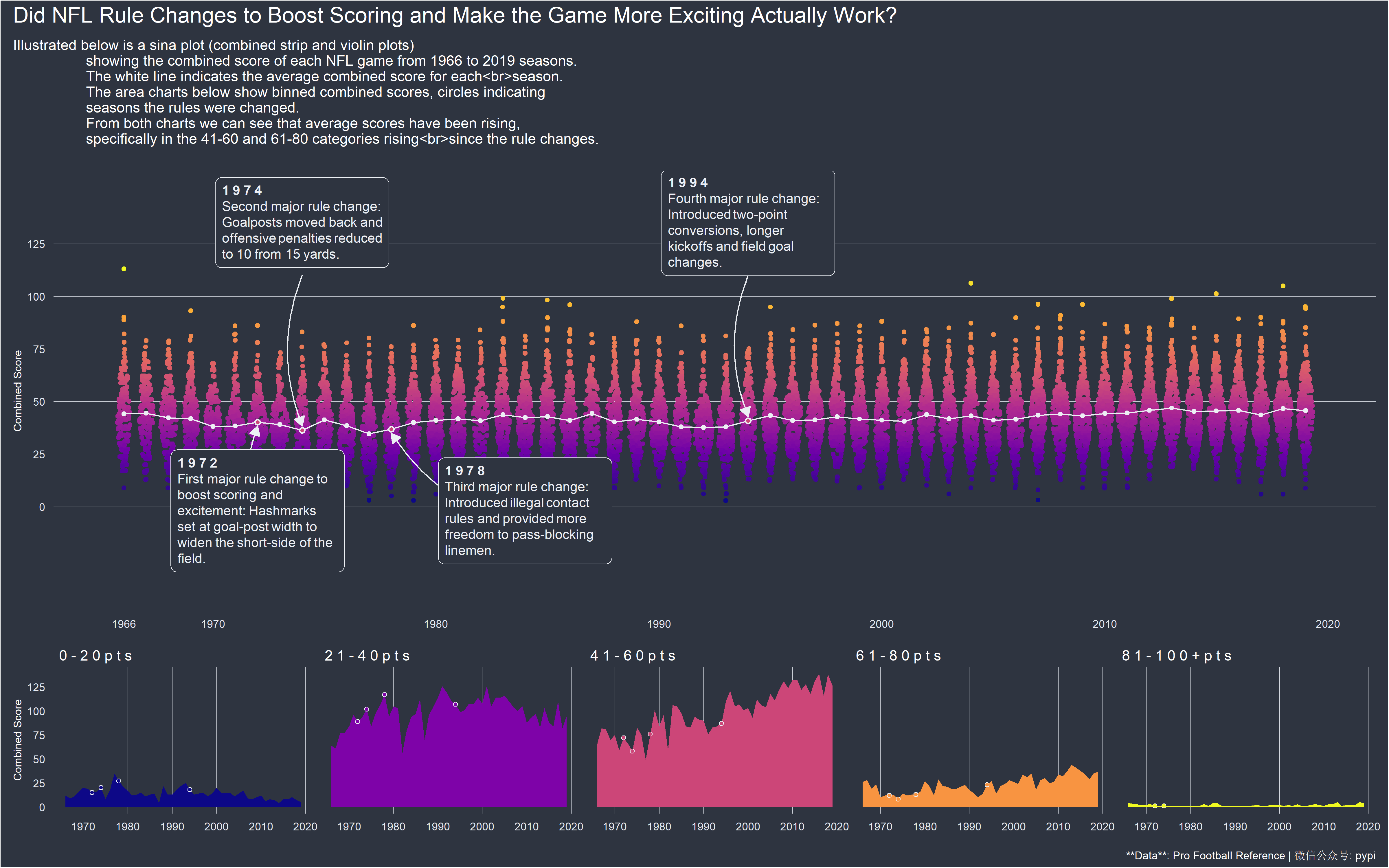
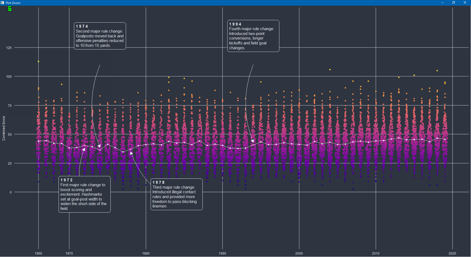
上面这个图看起来很复杂,其实只要把握正确的细节,就很简单。后来我看了源码,发现就是两个图进行加在一起,上面随机点是一个图,下面四个图是一个图,然后将两个图加在一起。就成了现在这样的图 安装相关包在之前有的包在CARN上是没有的,可以下面代码安装 install.packages("remotes") remotes::install_github("jkaupp/jkmisc") remotes::install_github("wilkelab/ggtext")别的包基本上都是在CARN上的 下面就是加载包,以及读取数据数据在我的github上,也可以看我的百度网盘。 数据链接为: 全部复制到浏览器,然后右键保存到本地 https://raw.githubusercontent.com/rfordatascience/tidytuesday/master/data/2020/2020-02-04/games.csv https://raw.githubusercontent.com/jkaupp/tidytuesdays/master/2020/week6/data/spreadspoke_scores.csv library(tidyverse) library(ggplot2) library(ggtext) library(here) library(ggforce) library(jkmisc) library(patchwork) library(viridisLite) library(colorspace) games % select(year, home_team = team_home, away_team = team_away, score_home, score_away) %>% mutate(total = score_home score_away, pts_win = map2_dbl(score_home, score_away, ~max(.x, .y)), pts_loss = map2_dbl(score_home, score_away, ~min(.x, .y))) %>% select(year, home_team, away_team, total, pts_win, pts_loss)上面代码我们一行一行的解释,首先是%>%管道函数就不介绍了,不懂得百度一下。 rename(year = schedule_season)这句话是:因为more_games这个数据框里面有个schedule_season变量,将这个变量名字改为year。感觉很怪异,是不是有一点!!!。 filter(year < 2000)这意思就是将前面一步一步处理的数据框,然后再筛选year < 2000的行。 select(year, home_team = team_home, away_team = team_away, score_home, score_away))这句话意思是:再对数据框的一些列进行选择,第一个year代表选择这一列,第二个home_team = team_home意思是:再选择team_home变量,再将这个变量名字改为home_team。 同样的away_team = team_away代表选择team_away,再将这个名字改为away_team。这个score_home, score_away也要选择。 mutate(total = score_home score_away, pts_win = map2_dbl(score_home, score_away, ~max(.x, .y)), pts_loss = map2_dbl(score_home, score_away, ~min(.x, .y)))这句话就是说,建立三个变量:第一个变量叫total,他的意义就是直接将score_home和score_away相加。第二个是pts_win,他的意义有点复杂,pts_win = map2_dbl(score_home, score_away, ~max(.x, .y))这句话就是选择score_home和score_away,判断这两个变量哪一个更大,哪个大选哪个。更加细一点,就是score_home对应的是x的位置,score_away对应的位置y,然后map2_dbl这个函数的第三部分的就是函数,前面加个~。用来识别函数。更加相似的的就是第三行代码pts_loss = map2_dbl(score_home, score_away, ~min(.x, .y))。就是为了选择两个中间最小的那一个。这样以看是不是很高效!!! 最后一行还是选择,然后将这系列处理的数据最终结果给hist_games。这个就是我们的hist_game。 数据part 2 full_games % select(year, home_team, away_team, pts_win, pts_loss) %>% mutate(total = pts_win pts_loss) %>% select(year, home_team, away_team, total, pts_win, pts_loss) %>% bind_rows(hist_games) %>% arrange(year)这个代码块不介绍了,比上面那个简单多了。 areas_data % mutate(total_bin = cut(total, c(0, 20, 40, 60, 80, Inf), labels = c("0 - 2 0 p t s", "2 1 - 4 0 p t s", "4 1 - 6 0 p t s", "6 1 - 8 0 p t s", "8 1 - 1 0 0 p t s"))) %>% count(year, total_bin)这个代码就是说,对dull_games变量数据框,对这个数据框的total变量进行分组,分组的各个标签就是上面label对应的。然后再根据year和total_bin变量进行分组计数。最后得到areas_data数据。 代码块part 1 areas % summarize(total = mean(total)) %>% mutate(total = ifelse(year %in% c(1972, 1978), total - 2, total 2)) %>% filter(year %in% c(1972, 1974, 1978, 1994)) %>% mutate(year2 = if_else(year == 1978, 1984, year), label_y = c(-2, 135, -2, 135), arrow_y = c(-10 ,110, -10, 110), label = c("**1 9 7 2**First major rule change to boost scoring and excitement: Hashmarks set at goal-post width to widen the short-side of the field.", "**1 9 7 4**Second major rule change: Goalposts moved back and offensive penalties reduced to 10 from 15 yards.", "**1 9 7 8**Third major rule change: Introduced illegal contact rules and provided more freedom to pass-blocking linemen.", "**1 9 9 4**Fourth major rule change: Introduced two-point conversions, longer kickoffs and field goal changes."))上面的代码还是没有第一个简单,第一个更加复杂。 这一个数据是这样的: 这个数据如下: 就是有时候看不懂代码的时候,就一个一个运行,就是运行加号之前的东西,一步一步增加,每一个加号就代表一部分。你只要看代码增加了,你的图怎么变得,反复看看,不停的比较,更加重要的就是看别人怎么写的,以及函数什么意思,只要数据对了,数据传递给正确的函数参数,基本上就没有问题。 |
【本文地址】